crafting a hospitality branding concept under time pressuere

CLIENT
KOBE Gastro Group
my role
Brand & Print Designer
duration
2 weeks
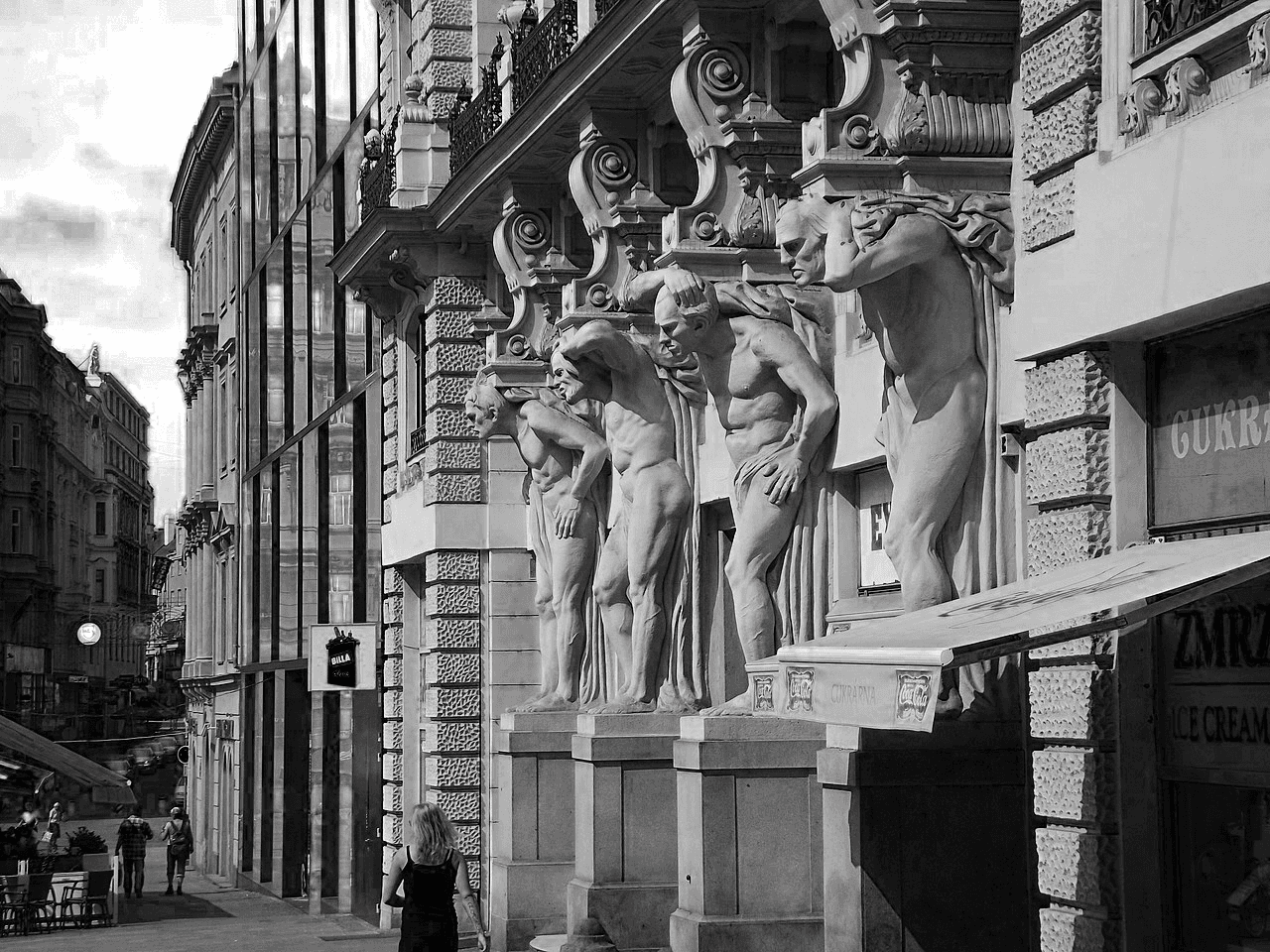
In May 2021 we have been asked to participate in a comptetiton for the branding of the new Brno-situated pub U Mamlasů. The client had a simple wish – incorporate the mythological Atlases into the branding, as they are a publicly known dominant of the building the pub is going to be located in.
We were also tasked with reflecting the vision of a sophisticated and guest-friendly establishment in an extremely short period of time – on 12th of May we received the brief and on 26th a presentation to the client took place.

Market & Competitor research
To ensure the uniqueness of the brand, we conducted location-specific and nationwide brand research. We mapped and analyzed all visual identities used on Svoboda Square to avoid visual clashes. We reviewed successful gastro brands across the Czech Republic — especially those under the Ambiente umbrella — to identify tone, style, and brand presence in the hospitality scene.
design process
first concepts


final identity
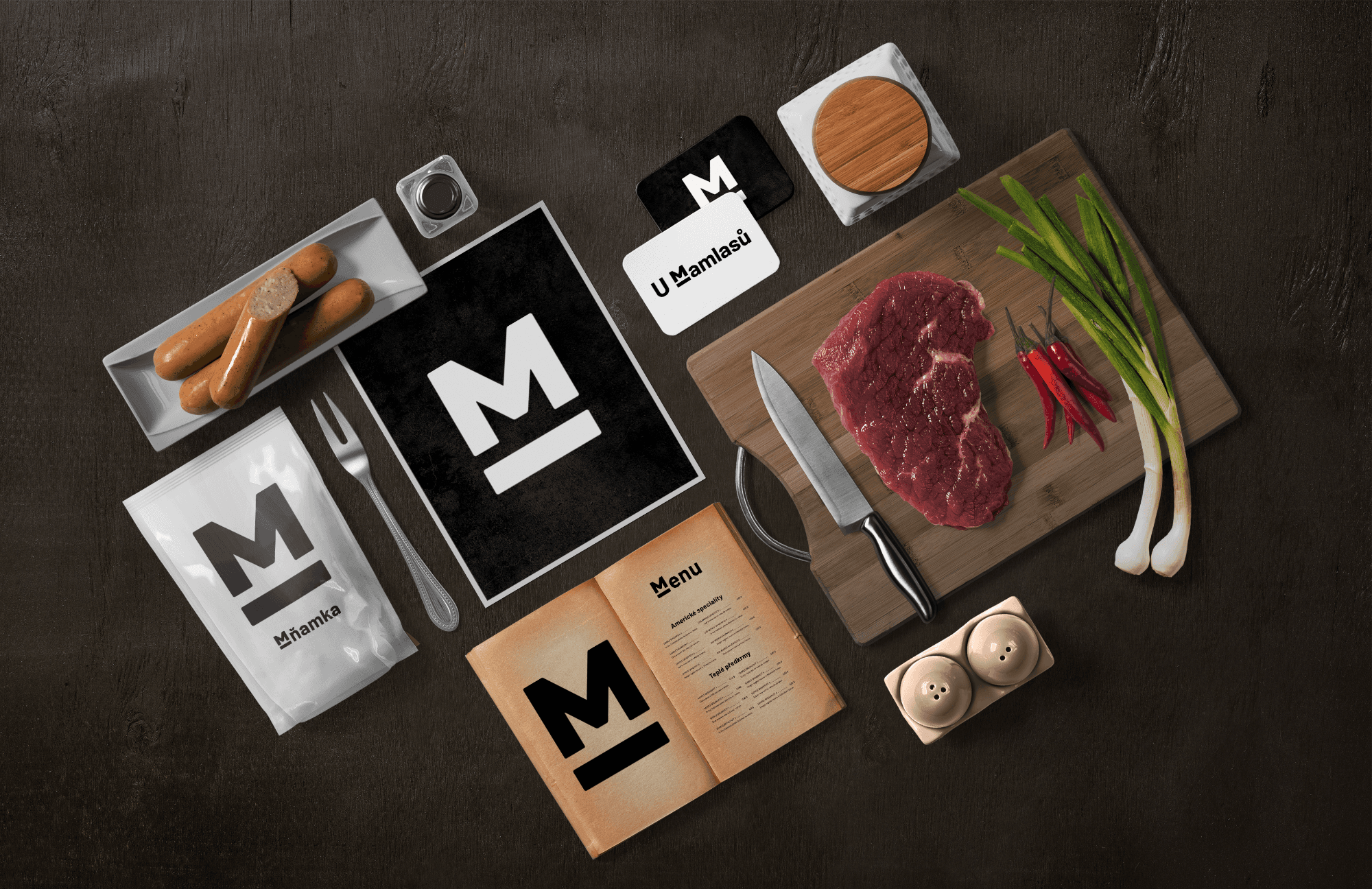
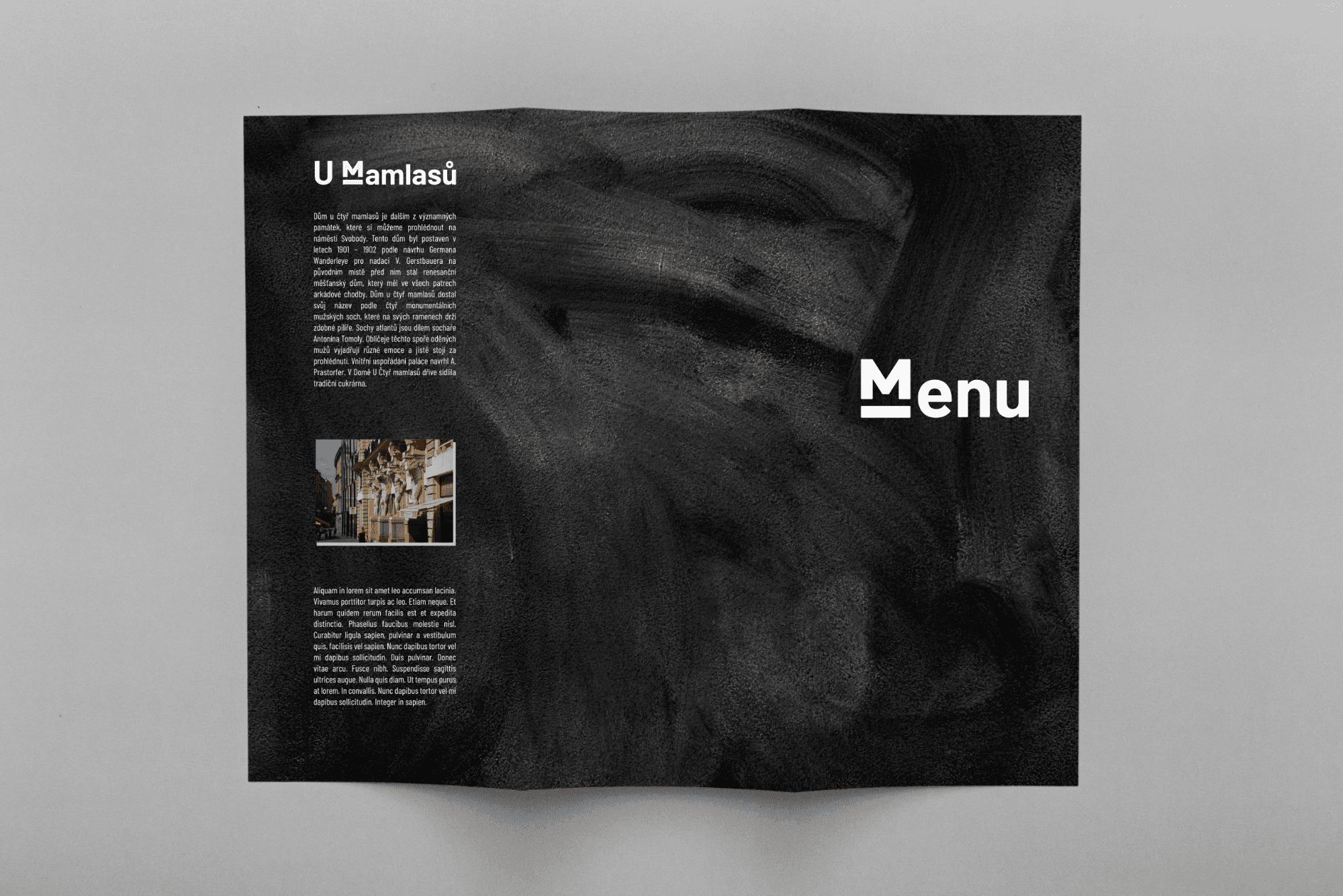
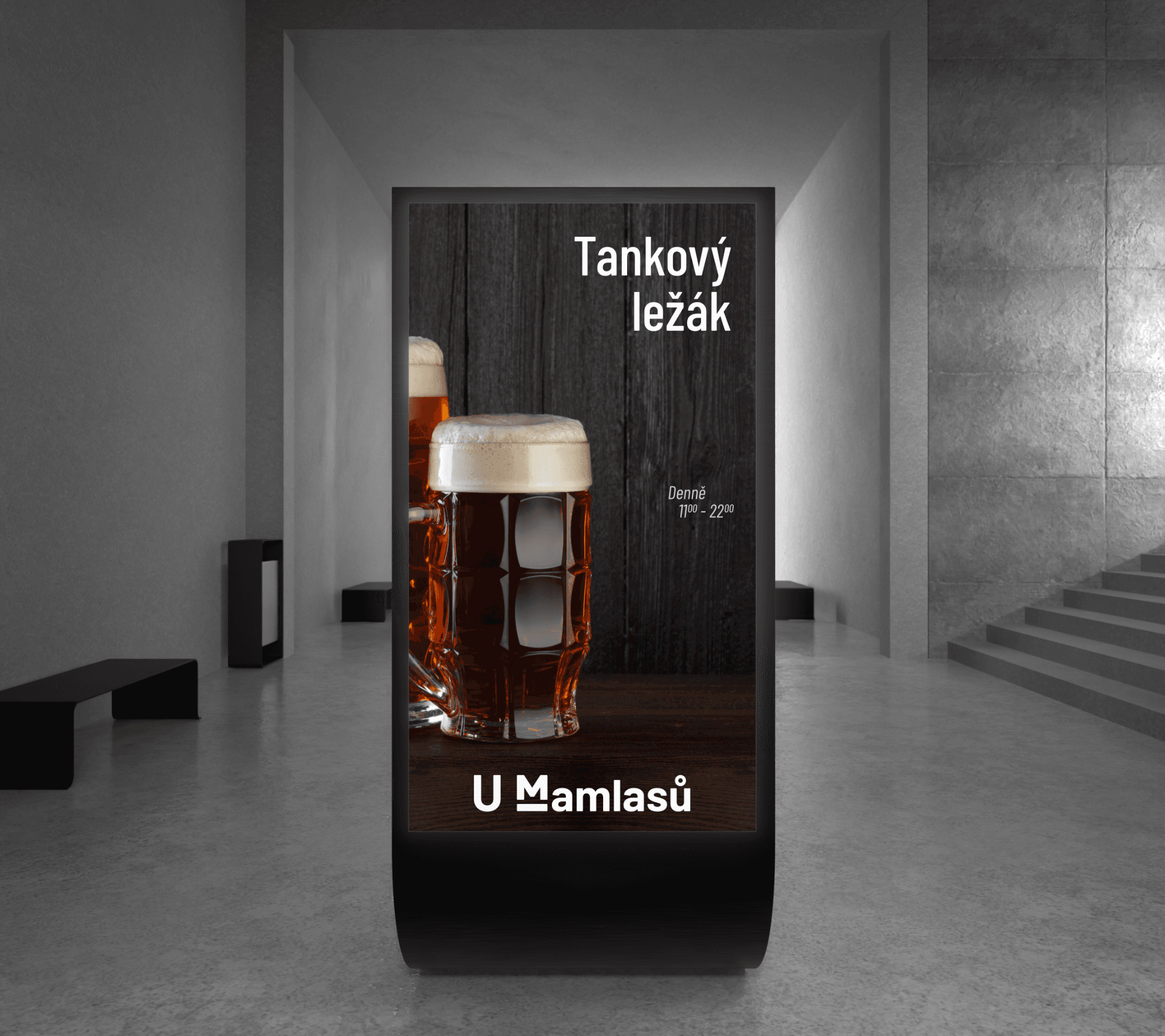
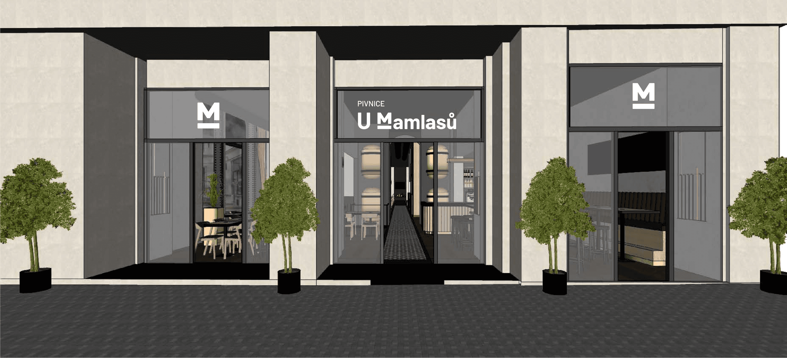
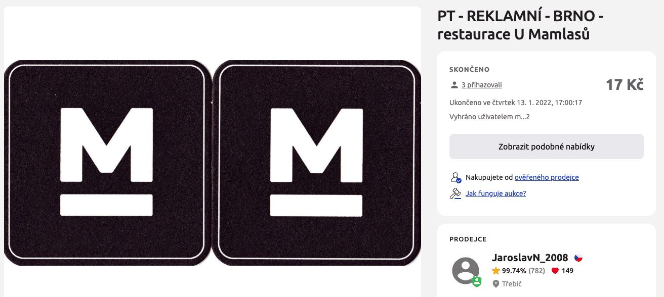
Our final concept centers around the minimalist M on a pedestal, symbolizing both the Mamlas sculptures and the support of a solid brand foundation. This motif became the anchor for all brand touchpoints – from menus and signage to packaging and social media.


Public Response
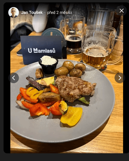
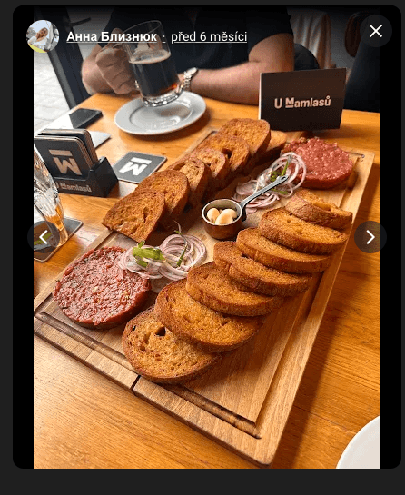
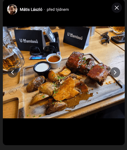
The brand quickly gained traction with visitors. As seen on Google Maps and Czech second-hand marketplaces, customers frequently photograph the logo and even resell branded merchandise — a strong indicator of emotional connection and brand recognition.

This project marked the beginning of a strong creative partnership with Kryštof Henzl, with whom I’ve since collaborated on several successful projects. The competition gave us both valuable insight into real-world workflows, collaboration with clients, and rapid concept delivery under pressure.
Head of Design at VŠKK, for inviting me to take part and supervising us during the competition.
Kreativní Kancl
For the opportunity to work on a real client brief and always asking us to create additional graphics for the client.
Jakub kaderka
For his valuable feedback and guidance throughout the process