accelarating information acquisition at telco call centers

ARTIFICIAL INTELLIGENCE IS BOOMING AND THE TELCO SECTOR IS NO EXCEPTION

O2 Buddy is an internal AI-powered assistant developed to support call center operators, retail employees, and office staff across the company. Its primary goal is to streamline access to complex telecommunications information—such as product details, roaming policies, and internal procedures—enabling employees to serve customers more efficiently and accurately.

CASE STUDY OVERVIEW

CASE STUDY OVERVIEW

project

O2 Buddy – AI chatbot

my role

UX/UI designer

duration

April 2024 – Present

Context & Problem

Context & Problem

Despite its intended role as a productivity tool, the original version of O2 Buddy had significant usability and design issues. As a result, employees – especially call center operators – experienced delays when retrieving information during customer interactions, reducing both efficiency and service quality.

Despite its intended role as a productivity tool, the original version of O2 Buddy had significant usability and design issues. As a result, employees – especially call center operators – experienced delays when retrieving information during customer interactions, reducing both efficiency and service quality.

outdated visual design

The interface did not reflect O2’s current brand identity and lacked visual coherence.

outdated design system

The assistant relied on UI components in the style of former brand design, and lacked specific ones for the usecase of an AI chatbot.

poor user experience

Key functions were difficult to locate, workflows were unintuitive, and content was poorly structured.

Non-responsive layout

The application was not optimized for various screen sizes or device contexts, limiting flexibility.

Former O2 Buddy user inteface

Project Objectives

Enhance Usability for Call Center Specialists

Enable operators to retrieve critical information faster, reducing cognitive load and supporting real-time decision-making during calls.

Ensure Scalability and Brand Alignment

Deliver a flexible, responsive, and brand-aligned interface suitable for additional internal users beyond the call center, including retail and back-office roles.

meet business and user requirements

Integrating templates and internal documentation for business continuity, and custom templates and interaction history for users, as research revealed.

User Research & Insights

User Research & Insights

To ensure the redesign of O2 Buddy was grounded in real user needs and technically feasible within organizational constraints, we followed a structured, research-driven process. This included direct engagement with end users and iterative design exploration. Our goal was to create a solution that not only improved the user experience but also delivered measurable impact across key business workflows.

To ensure the redesign of O2 Buddy was grounded in real user needs and technically feasible within organizational constraints, we followed a structured, research-driven process. This included direct engagement with end users and iterative design exploration. Our goal was to create a solution that not only improved the user experience but also delivered measurable impact across key business workflows.

User Research

User Research

To ensure the redesign addressed real pain points, we conducted:

Contextual inquiries

with call center staff to observe Buddy usage in live scenarios.

in-depth interviews

with specialists to gain valuable insights into user needs.

Usability tests

on the existing interface to identify inefficiencies and areas for improvement.

Technical reviews

to assess system constraints and integration requirements.

Key Insights

Key Insights

inaccessible templates

Specialists have to work with templates, tho those were saved in a shared Word document – they had to find the document, copy each template and paste it which led to approx. 5 second delays in customer care.

selecting a segment

Before each conversation, an operator had to select a segment to start typing despite 70 % of customers on help desk were residential.

intuitive design

The AI assistant lacked intuitive interaction patterns compared to other AI chatbots present at the time of the research.

multi-care solution

The interface failed to support efficient multitasking and role-specific needs. Users usually have 5 conversations with Buddy simultaneously.

daily history

The UI lacked daily chat history and operators asked for this feature, as they usually have 50-120 conversations (junior–senior levels).

intuitive design
intuitive design

The AI assistant lacked intuitive interaction patterns compared to other AI chatbots present at the time of the research.

The AI assistant lacked intuitive interaction patterns compared to other AI chatbots present at the time of the research.

multi-care solution
multi-care solution

The interface failed to support efficient multitasking and role-specific needs. Users usually have 5 conversations with Buddy simultaneously.

The interface failed to support efficient multitasking and role-specific needs. Users usually have 5 conversations with Buddy simultaneously.

daily history
daily history

The UI lacked daily chat history and operators asked for this feature, as they usually have 50-120 conversations (junior–senior levels).

The UI lacked daily chat history and operators asked for this feature, as they usually have 50-120 conversations (junior–senior levels).

AI CHATbots Research

AI CHATbots Research

As part of the discovery phase, we conducted a focused research stream on existing AI assistant technologies to better understand current patterns, interaction models, and user expectations. This included benchmarking leading AI-driven tools such as ChatGPT, Microsoft Copilot, and Perplexity AI, alongside a broader evaluation of conversational and task-based chatbots.

As part of the discovery phase, we conducted a focused research stream on existing AI assistant technologies to better understand current patterns, interaction models, and user expectations. This included benchmarking leading AI-driven tools such as ChatGPT, Microsoft Copilot, and Perplexity AI, alongside a broader evaluation of conversational and task-based chatbots.

Design
Strategy

Design Strategy

Based on our findings, we defined four design priorities:

1
Task Efficiency

Reduce the number of steps required to retrieve relevant information.

2
expectable UI

Design an interface self-evident enough the user will not have to think in a rush.

3
Multi-chat feature

Ensure users do not have to switch between multiple browser tabs.

4
Brand Integration

Apply O2’s updated visual identity consistently throughout the assistant.

new ux & UI

Solution Overview

segment selector

As the research showed, 70 % of customer care is residential oriented, thus we removed the former "Choose a segment" step. Users now immediately start a conversation in a residential segment on launch, then in the segment they had last conversation in.

The selector is present both in the menu and under the input field to allow users to focus on one area at the time.

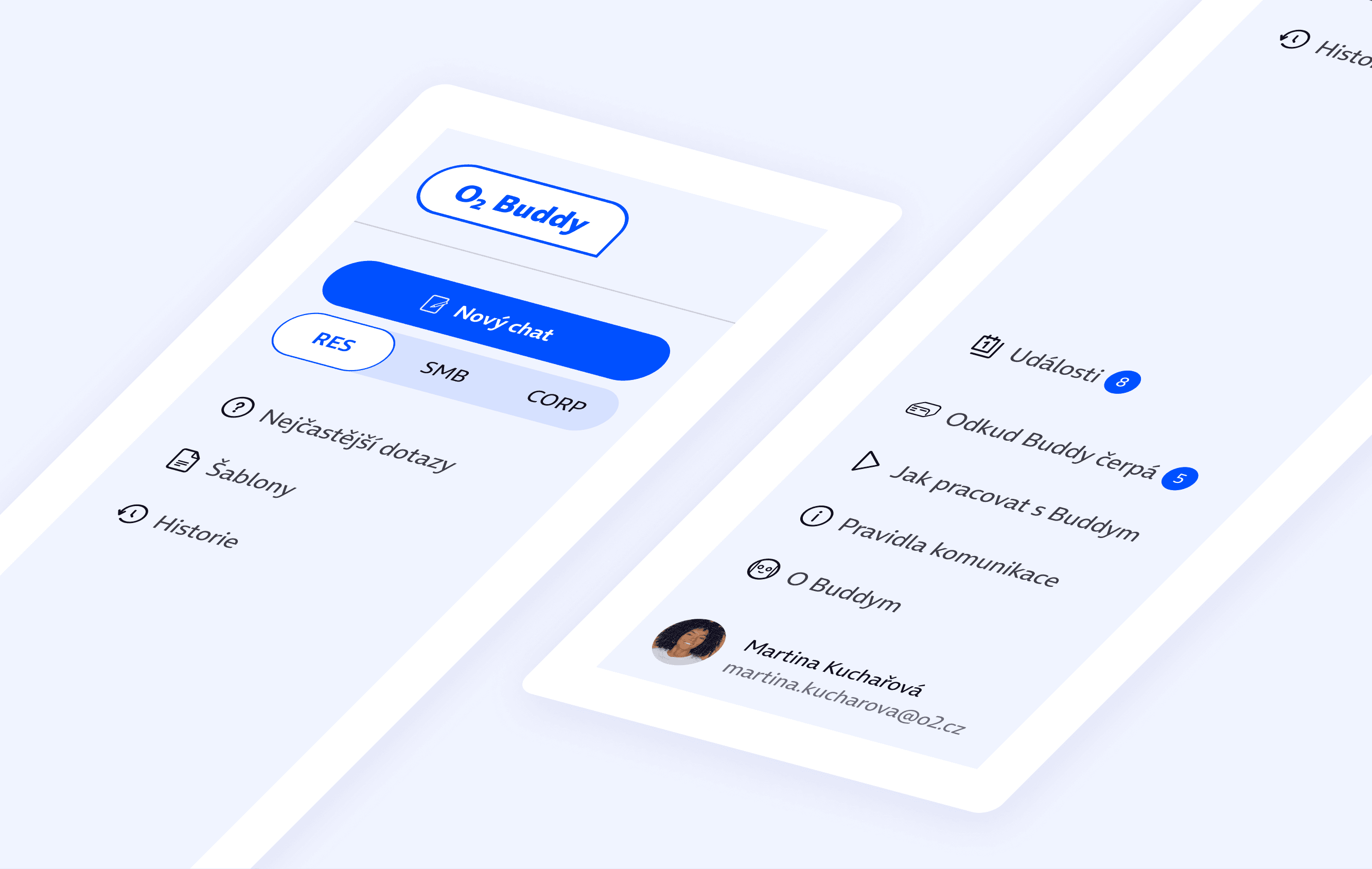
easy access to templates and history

By incorporating a side menu, we ensured all features are easily accessible and ready for use in a fast-paced environment of telco callcenters. Templates, history, events or documentation are now one click away.

conversation tabs in the ui

To eliminate the need to have multiple active browser tabs, we have designed an integrated tab bar. Conventionally, each tab is named after the first inquiry, and additionally it contains a segment indicator for quick orientation.

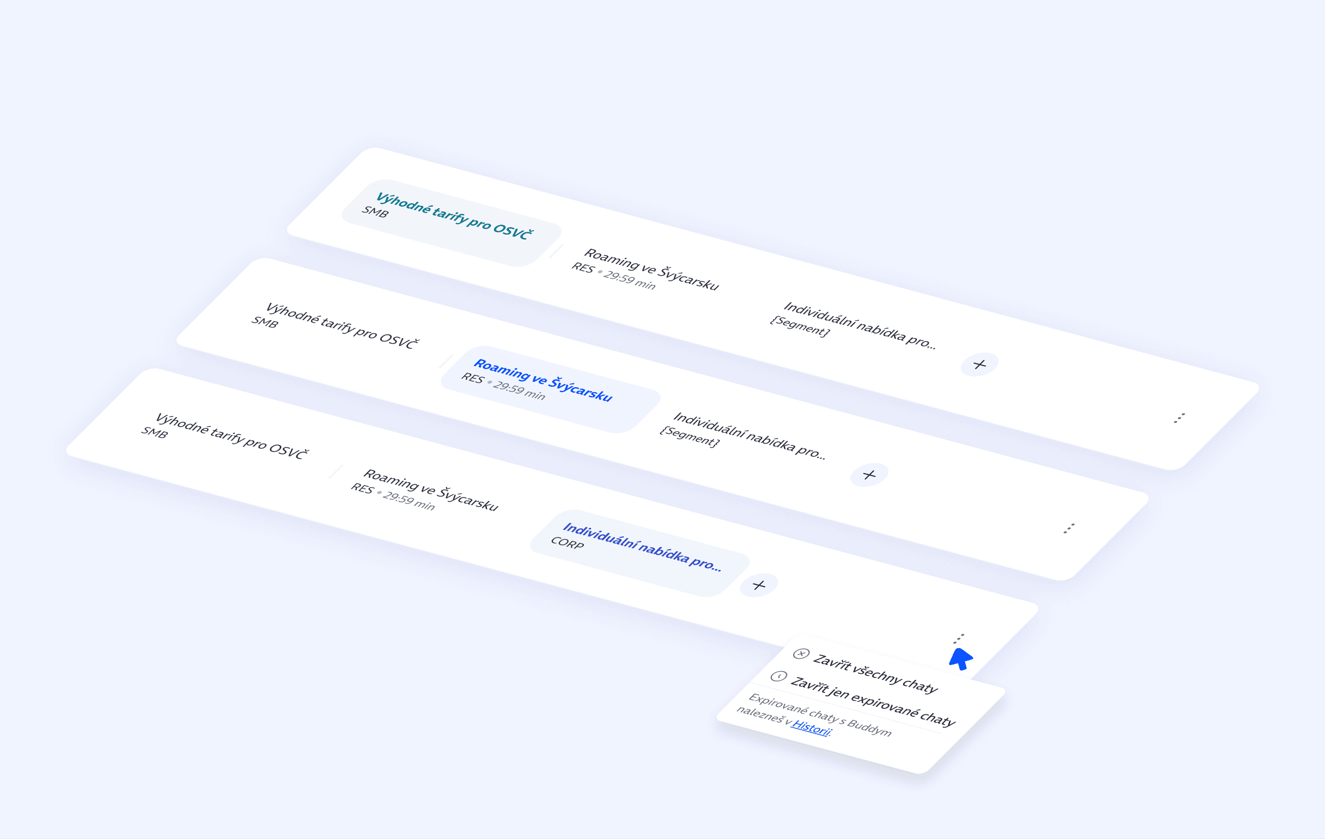
visual segment differentiation

To reduce the risk of disorientation in the user interface, we have used different colours for each segment. Now, the user knows straight away which segment is active at the moment, as the whole UI changes it's hue.

(The image is blurred on purpose😁)

user testing
results

user testing
results

We conducted two rounds of usability testing in collaboration with a dedicated UX Research team to validate the effectiveness of our design solutions. The first round involved 7 respondents testing two early-stage prototypes (A/B testing), providing critical feedback on interaction patterns and structural clarity. The second round focused on the final prototype, with 5 respondents evaluating the refined experience. This process ensured that the solution delivers both high user satisfaction and practical value in real-world workflows.

We conducted two rounds of usability testing in collaboration with a dedicated UX Research team to validate the effectiveness of our design solutions. The first round involved 7 respondents testing two early-stage prototypes (A/B testing), providing critical feedback on interaction patterns and structural clarity. The second round focused on the final prototype, with 5 respondents evaluating the refined experience. This process ensured that the solution delivers both high user satisfaction and practical value in real-world workflows.

1
great orientation

All interactive elements were successfully identified and understood by respondents, including their functions and destinations. However, within the corporate segment, feedback indicated that the visual differentiation was not sufficiently clear. A colour adjustment was recommended to enhance clarity and improve user recognition in that context.

2
multiple chats

"The appearance of the chat tab in the top navigation bar was met with clear approval and excitement from users." – an official statement from the UX Testing Handoff.


3
events are welcome

The event section was visually prominent and well-received by users, who easily understood how to access event details. One respondent expected a link to Infoservis, suggesting potential for clearer integration. In the event detail view, users assumed closing the window would return them to the dashboard, not the full event list—indicating a need to refine the navigation flow.

4
practical UI

Although the alternative prototype was perceived as more visually appealing and clearer, the final version was described as “straightforward” and “more practical”—qualities that are essential when the primary goal is to save time and support efficient workflows.4o


Final interface

Reflection & Lessons Learned

Reflection & Lessons Learned

O2 Buddy was one of the most engaging and rewarding projects I’ve had the opportunity to work on. It allowed me to explore the UX/UI aspects of AI chatbots while designing a solution that feels both timely and relevant within the global conversation around artificial intelligence. The project also reaffirmed how much I value collaborative work—especially in environments where each designer brings their own perspective, and we collectively work toward a unified synthesis.

O2 Buddy was one of the most engaging and rewarding projects I’ve had the opportunity to work on. It allowed me to explore the UX/UI aspects of AI chatbots while designing a solution that feels both timely and relevant within the global conversation around artificial intelligence. The project also reaffirmed how much I value collaborative work—especially in environments where each designer brings their own perspective, and we collectively work toward a unified synthesis.

final thanks

final thanks

dana adamová

My close colleague throughout the project, with whom I collaborated on research, design, and prototyping. Beyond our professional synergy, we also shared countless conversations about life when we needed a break from pixels and flows.

Petr mouric

The Head of AI Assistants at O2, business stakeholder overseeing the assignment and a valuable participant in the user testing process.

O2 UX Research

Special thanks to Zdena Kučerová and Silvie Přikrylová Sklenářová for conducting usability testing and gathering critical insights that directly informed key design decisions.